Project 4: Music over the last 50 years. Data Visualization
Has popular music truly changed over the last 50 years?
We bring something different this time. Would it be possible to show the evolution of popular music over the last five decades using visualizations?
We examined a dataset from Kaggle that contains more than 175.000 songs from the Spotify Website API. Find the link to the dataset below. Some of the most relevant variables:
- artists (List of artists mentioned)
- release_date (Date of release)
- name (Name of the song)
- acousticness (Ranges from 0 to 1)
- danceability (Ranges from 0 to 1)
- energy (Ranges from 0 to 1)
- duration_ms (Integer typically ranging from 200k to 300k)
- valence (Ranges from 0 to 1)
- popularity (Ranges from 0 to 100)
- loudness (Float typically ranging from -60 to 0)
- year (Ranges from 1921 to 2020)
After understanding the dataset with an Exploratory Data Analysis and applying some transformations, we created our figures.
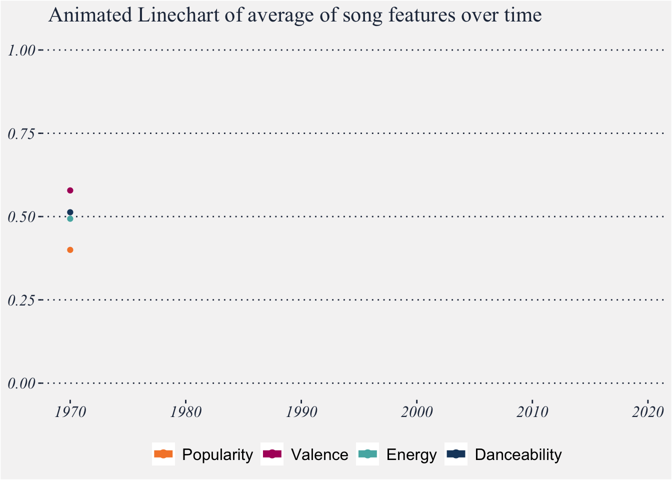
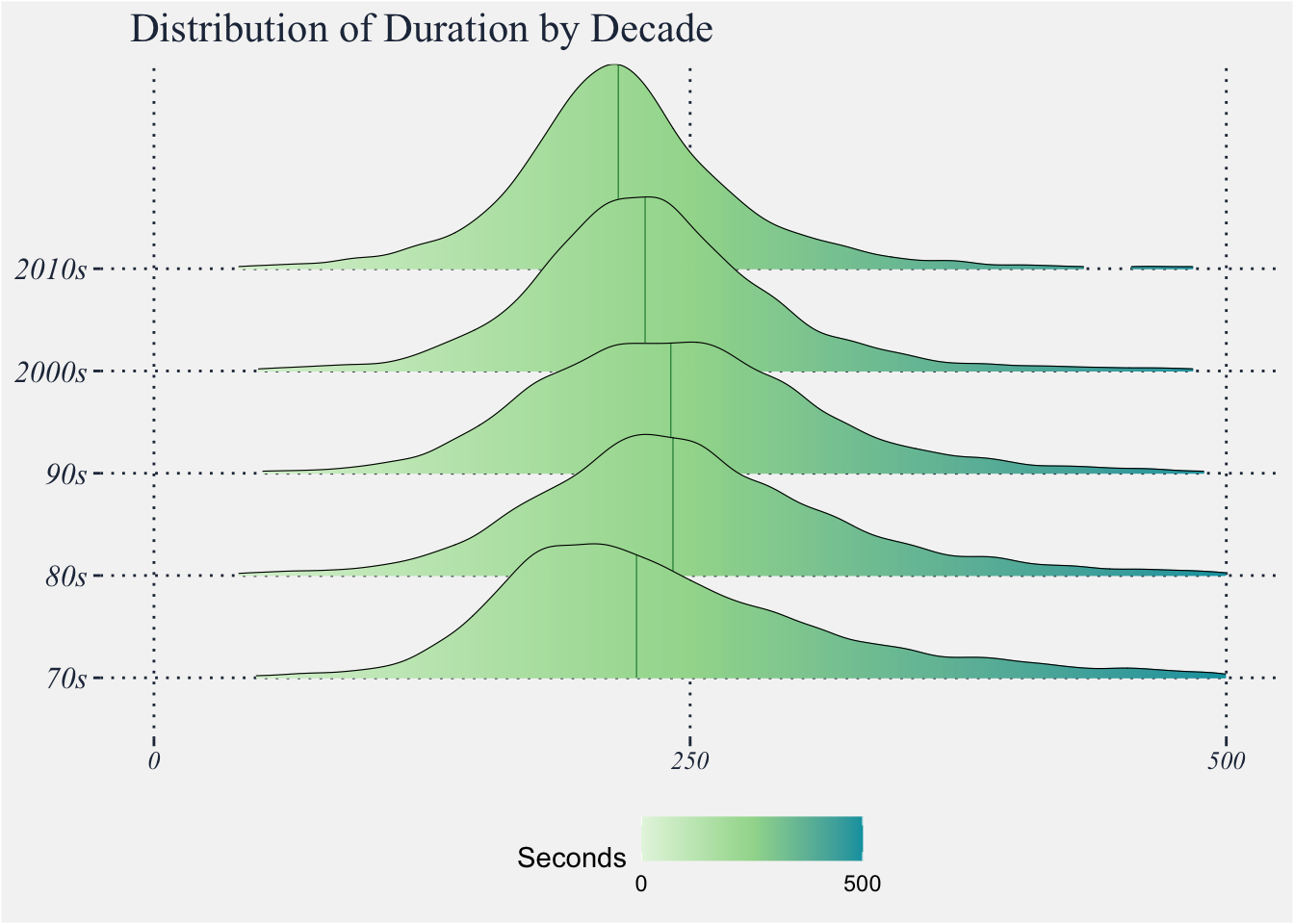
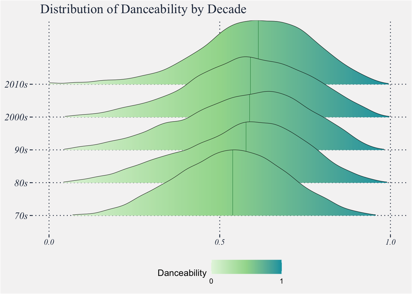
By just looking at our visualizations we were able to some patterns. Firstly, newer songs tend to get better scores in danceability, energy and popularity. Secondly, the songs before the 200’s used to have a distribution with fatter tails compared to the songs after the 2000’s. Additionally, the median of the duration of the songs has also been decreasing over time. Thirdly, loudness has also increased on average between the 70’s and the last decade.
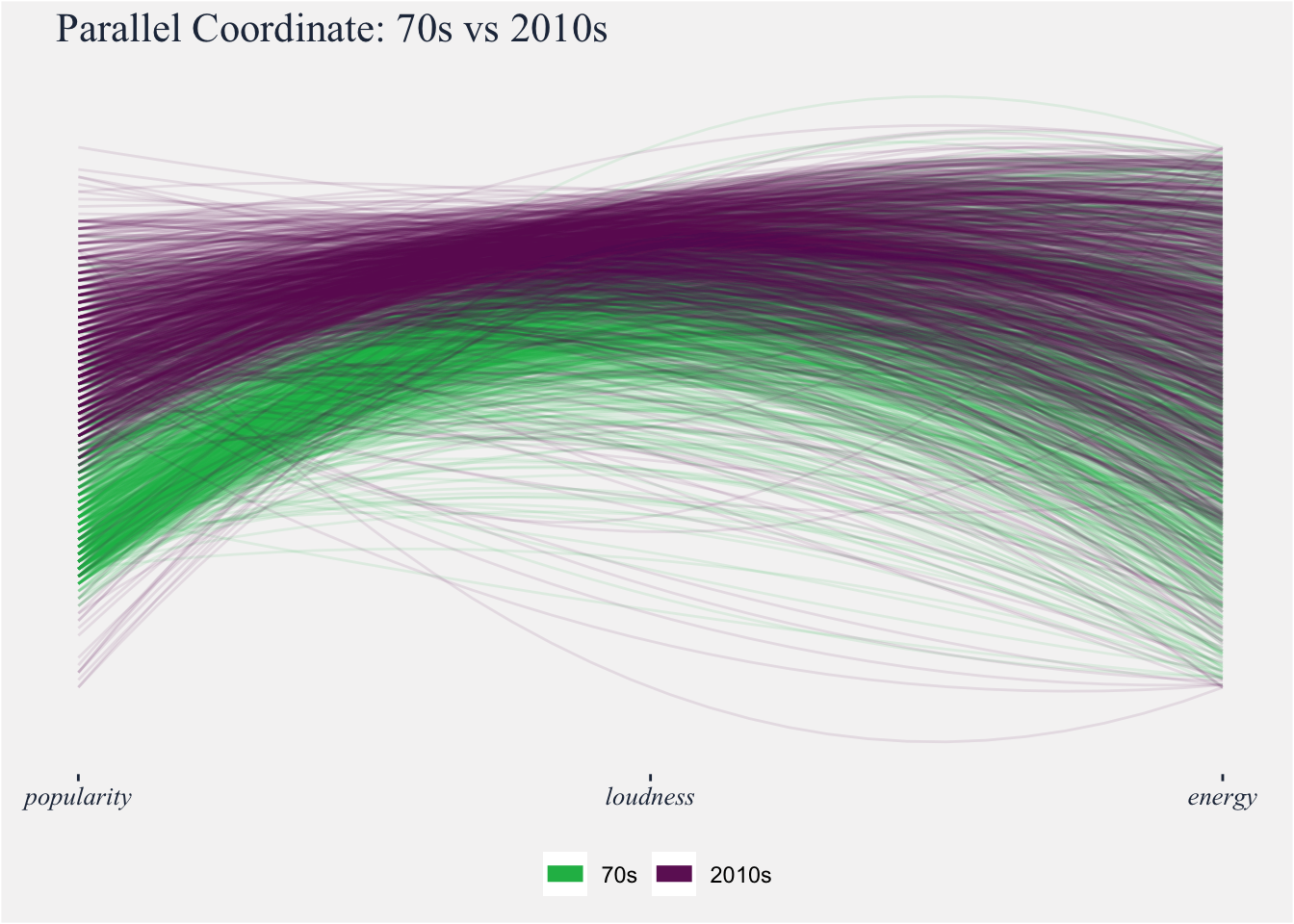
Finally, we compared the artist with the highest popularity before the 200’s, Frank Sinatra, with Taylor Swift, the most popular artist after the 2000’s.
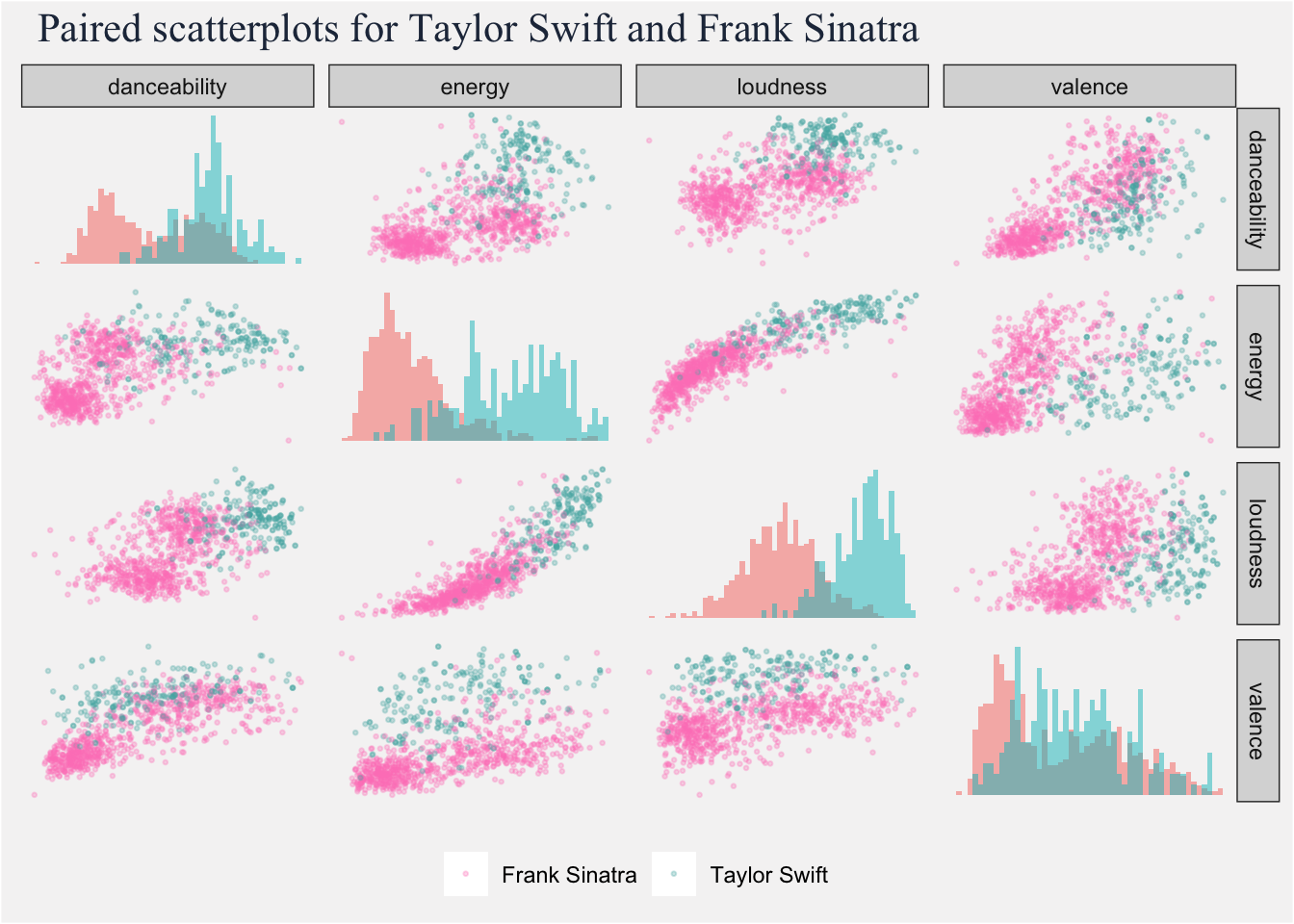
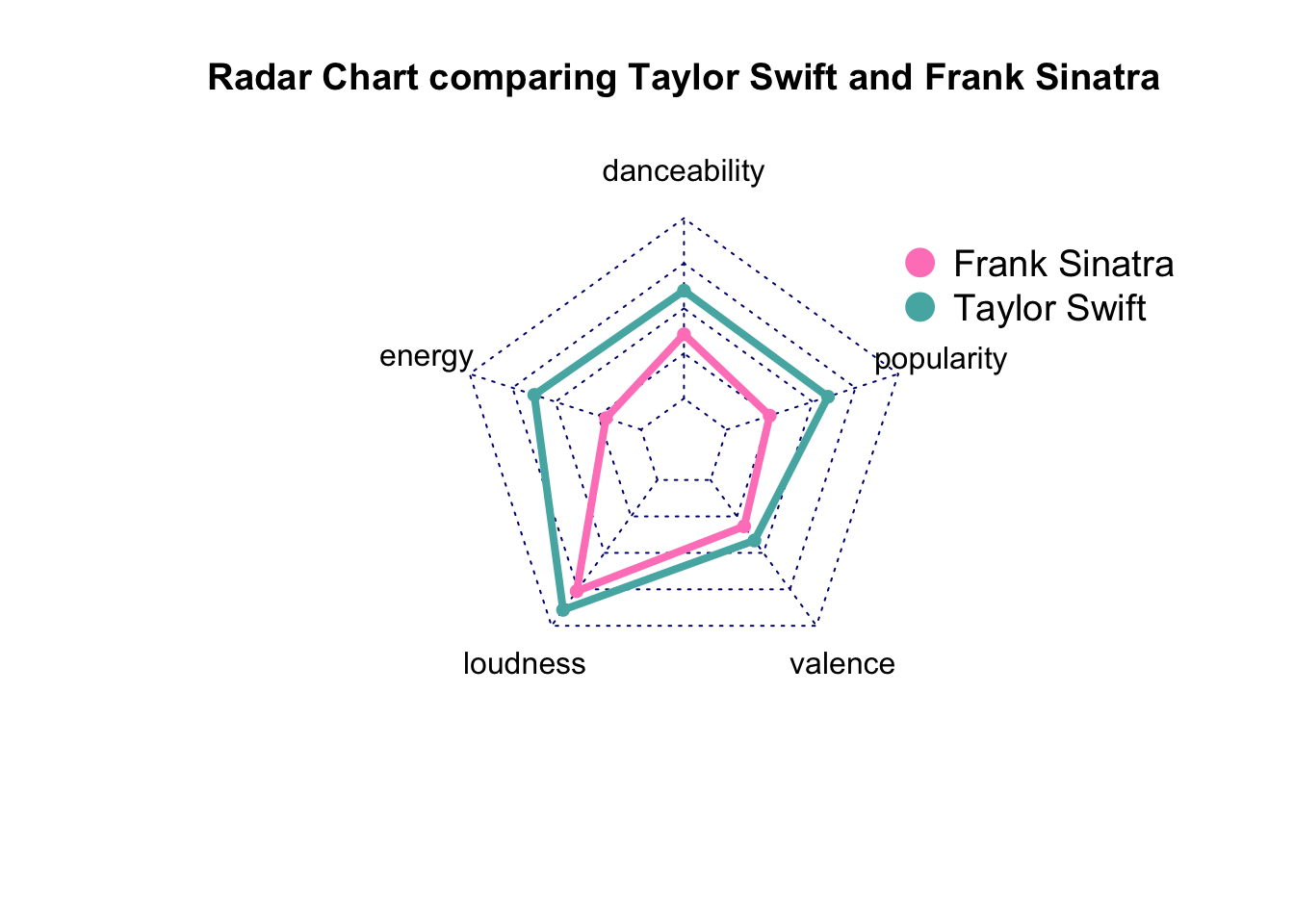
We see that their music pretty much reflects the patterns observed before. Taylor Swift, the youngest artist, offers to her fans songs with higher danceability, valence, loudness and energy.
Find the code here: https://gist.github.com/OriolVila/708843095da6600c2e8b7e18f623ff3d
Dataset: https://www.kaggle.com/yamaerenay/spotify-dataset-19212020-160k-tracks