Project 2: Animated Figures. GDP and Life Expectancy
GDP Evolution has always been one of my favourite topics. Why are some countries richer than others? Are poorer countries really catching up? The fact is that GDP per capita seems to be positively correlated with Life Expectancy, and I thought it would be valuable to visualize how they have evolved over the last decades.
The goal of this project is to dynamically visualize the GDP per capita evolution, life expectancy and population growth by continent over the years. The data are obtained from the R package “gapminder” which contains the following variables: country, continent, year, life expectancy, population and GDP per capita from 1952 to 2007.
In addition to the popular visualization library “ggplot2”, we will also use the package “gganimate” to make our figure more dynamic. Since we aim to see the evolution by continent, we need to create some new variables. Lastly, remember that we used “size” in aesthetics to add information about the population. That is why we can see three different variables represented over time.
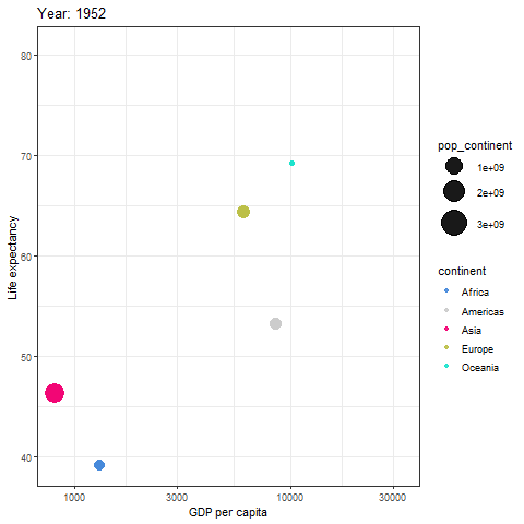
Evolution of GDP per capita, Life Expectancy and Population (1952-2007)
Once we see the output of our code we can easily identify new patterns. The main insight is that Asia is rapidly catching up with Europe, America and Oceania, while the African continent seems to be stuck in terms of GDP per capita and life Expectancy.
Code: https://gist.github.com/OriolVila/3a87c6358c87697a439d35564a9faa9e